24 October 2025
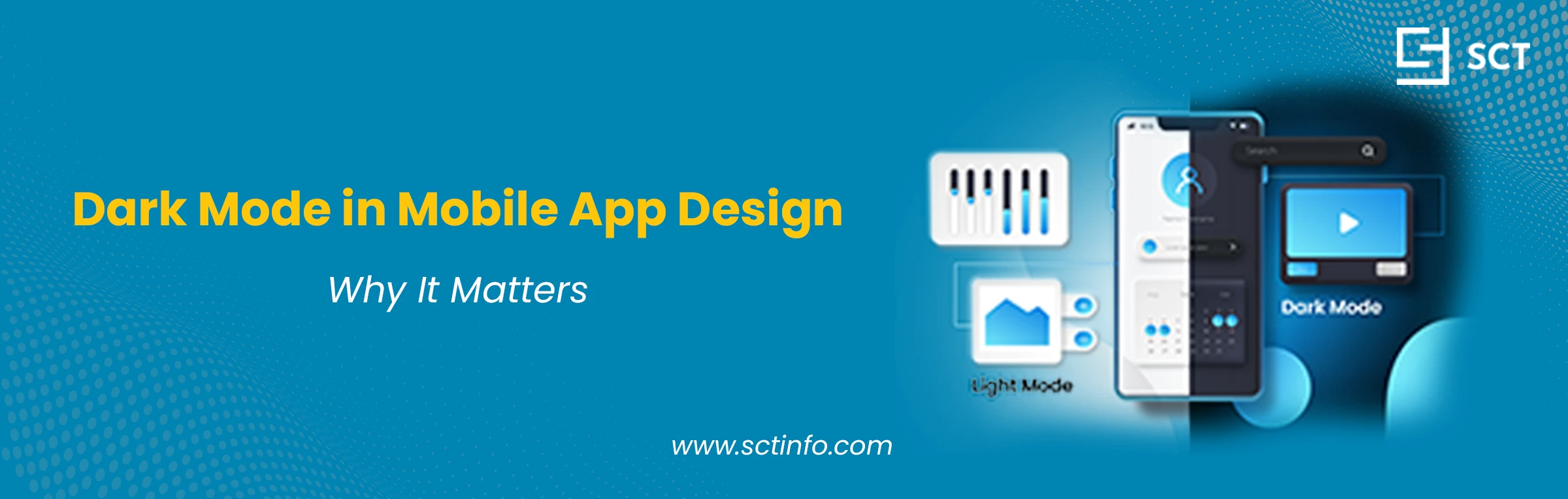
Slide on over, check your phone’s settings. Odds are, you get to choose between “Light” and “Dark” mode, or perhaps you have it set up to change automatically according to the time of day. This used to be a niche feature for tech enthusiasts a few years ago. Today, it’s a standard expectation.
We’ve all been there. It’s dark, you’re scrolling on your phone, and you open up an app that assaults you with a blast of bright white light. It’s jarring and uncomfortable, but it’s also a perfect illustration of a poor user experience.
Here’s where dark mode in mobile app design comes into play.
It’s much more than a mere aesthetic or passing trend. It has overtaken the user-centered design in today’s era, impacting everything ranging from eye strain and battery utilization to audience perception of your brand. If you develop a mobile app that doesn't have a dark mode, you're not just behind the times; you might be actively alienating your users.
The Rise of Dark Mode
Dark interfaces aren't new. If you’ve ever watched a film about 80s hackers, you’ve witnessed the classic green text on black screen look. Those early monitors employed cathode-ray tubes (CRTs) in which “off” was black and “on” meant a phosphor glow. Dark themes have long been favored by coders and other power users who like to reduce eye fatigue during long hours of work.
But for the everyday consumer, white became standard. That was a deliberate design decision, a kind of skeuomorphism. Early computers and graphical interfaces strove to emulate real-world objects to avoid feeling too scary. What medium is most frequent? White paper with black text. So, digital "pages" became white.
So, what is putting dark mode back in the spotlight?
It was the technological moment, and what users wanted.
OLED Screen Technology: This is what started the whole thing. But what makes OLED screens different is that, unlike old-school LCDs, which have a constant backlight (so “black” was technically just dark gray and consuming electricity), individual pixels light themselves. In an OLED display, each pixel is its own little light source. To show black, the pixel shuts off. Completely. This meant that a dark interface could actually help save a significant amount of battery life. As flagship phones began to ship with OLED screens, the functional advantage of dark mode became tangible.
OS-Level Adoption: The turning point was when Apple and Google adopted it. Both Android 10 and iOS 13, the most recent revisions to each operating system, have added dark mode as part of their overall designs. This was a clear signal. Suddenly, people could turn one dial and see their whole digital environment change.
User-Side Demand: People just… liked it. This one felt new and shiny and modern. And it was more restful on the eyes at night, and brought a fresh look to familiar apps. As soon as users had a taste of a system-wide dark theme, that one app still blindingly hopelessly with a white screen, really started to stand out like a sore thumb.
It was a niche preference among developers that became an expectation in the mainstream.
Why Dark Mode Matters
One of the easiest would have been “dark mode,” one of those cosmetic, low-priority items you add as niceties after all your “real” features are built. This is a mistake. Dark mode has real implications for your app and its brand.
First, it’s also about user expectations and comfort. When a user has dark mode turned on for their entire phone, they are making an explicit decision to do so. They want a darker experience. So when your app disregards that choice and confronts them with a bright-light environment, it’s causing friction. It just feels rude, as if the app is shouting when all the user wants is a whisper.
Second, it’s about brand perception. An app that resists dark mode in today’s world can appear out of date. It gives me a sense of design being unchecked, or it does not fit with modern design. It makes your app look abandoned. Alternatively, giving a well-executed dark mode actually says that you're considerate, up-to-date, and give some thought to what the user wants.
And, last but not least, it’s about access and options. Good design provides control to the user. There are some users with visual sensitivities, such as having photophobia (sensitivity to light), and perhaps even certain kinds of low vision, for whom light text on a dark background actually makes the words easier to read. For them, dark mode is not a preference; it’s an accessibility requirement.
If you approach dark mode as an optional add-on, then you are saying that a bevy of people in your user base don’t deserve to be comfortable, or their preferences aren’t important.
Benefits of Dark Mode
Properly implemented, a dark theme has actual, measurable benefits for your users.
Prevents Eye Strain: A bright white screen is just a light directed at your face. This can actually be physically uncomfortable in low-light conditions (like staring at your phone in bed), leading to a lot of squinting and resulting eye strain. A dark theme has much lower overall screen luminance, which is a lot easier for the eye to read when reading for a long time, like at night.
Increases Battery Life (on OLED Screens): Since black pixels are turned off on an OLED screen, a dark-UI app uses less power than a white-UI app does. Google found that out for themselves, revealing in their own research that a dark version of the YouTube app saved 60% battery at max brightness compared to its light counterpart.
Improves Visual Hierarchy and Focus: Think of a dark background as the velvet cushion in a jewelry box. It causes colorful content to pop, like graphs, dashboards, and photographs.
Makes it easier to read in the Dark: A dark theme allows the app to be used in places where a white screen would be blinding, such as a dark living room, a car at night, and yes, even inside a movie theater.
Provides an Aesthetic Option: A lot of users just think it looks cool. It's slick, it's modern, and it can provide a premium feel to the design of an app.
Challenges of Implementing Dark Mode
So, why doesn’t every app have dark mode if dark mode is so good? Because doing it right is a whole lot harder than it may seem. It is so much more complex than just changing your colors around.
It’s Not Just “Inverting” Colors: Simply flipping a white background (#FFFFFF) to black (#000000) breaks everything.
Preserve Brand Identity: Bright brand colors may not look the same on dark backgrounds and often require desaturated, lighter versions.
Avoid Pure Black: Pure black (#000000) can cause halation, so using dark gray (#121212) is easier on the eyes.
Readability and Contrast Ratios: Test color combinations against WCAG standards.
Handling Images and Media: You must decide whether to dim images, create two versions, or adjust dynamically.
Increased Design and Development Time: Designing two themes doubles your testing and maintenance effort.
Best Practices for Dark Mode Implementation
-
Use dark grey instead of pure black.
-
Create a brand new, well-tested color palette.
-
Respect text opacity to create hierarchy.
-
Give users control (Light, Dark, or System Default).
-
Test accessibility rigorously.
-
Adjust semantic colors and desaturate vibrant tones.
Conclusion
Dark mode in mobile app design has made its transition from a “niche preference” toward being an integral element of a professional contemporary application. It’s not just an aesthetic choice anymore, it’s about comfort, accessibility, energy efficiency, and modern branding.
Yes, doing it right is hard and time-consuming, but in the end, it delivers a cleaner, more usable, and more professional product that respects users’ preferences.
Ultimately, it’s plain and simple: users want the choice. Don’t be the app that blinds them when they’ve asked for the dark.