14 November 2025
In finance, data is everywhere. But honestly, raw data alone doesn’t help much. You open a spreadsheet and see a wall of numbers. Sure, it’s technically information, but it doesn’t tell you what’s really going on.
That’s why dashboards matter. A good dashboard translates all that noise into something you can actually use. It takes the stress and complexity out of the picture and turns it into a story you can act on. You glance at it, and within seconds, you know: Here’s how things stand, what’s going well, and what needs attention.
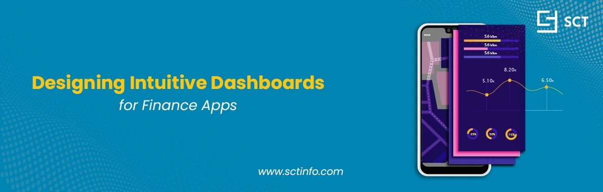
Building an “intuitive” dashboard, though? That’s the tricky part. It’s easy to tip from a clear summary into a confusing mess. For finance apps, that first dashboard screen is everything; it’s the app’s first impression, its elevator pitch, and, for many users, the reason they’ll stick around (or not).
Nail it, and users feel calm, smart, and in control. Miss the mark, and they’re overwhelmed or frustrated, and probably shopping for another app.
So, how do you get it right? Start by thinking about who’s using the dashboard, and what they need to know.
4 Types of Fintech Dashboards (and What They Actually Show)
There’s no such thing as a one-size-fits-all dashboard. A day-trader and a CFO need totally different views. Before you start designing, figure out the dashboard’s real job. Here are four types you’ll see most often.
1. Financial Performance Dashboards
Who’s this for? Executives, business owners, and senior managers.
What’s its job? Give a bird’s-eye view of the company’s financial health.
What does it show? This dashboard keeps things big-picture. No one cares about every invoice here. It’s all about the KPIs that matter most. Are we winning or losing? You’ll usually see:
-
Revenue vs. Goal
-
Profit & Loss (P&L)
-
Operating Margin
-
EBITDA
-
Monthly Recurring Revenue (MRR)
-
Customer Acquisition Cost (CAC)
Keep the design uncluttered and professional. Trends matter more than individual transactions, showing quarter-over-quarter or year-over-year changes.
2. Expense Tracking Dashboards
Who’s this for? Everyone, from personal finance app users to department heads.
What’s its job? Answer the question: “Where’s my money going?”
What does it show? It’s all about categories and budgets. The dashboard should sort transactions for you and make the numbers easy to digest. You’ll want features like:
Spending by Category: Pie charts or bars that break down “Food,” “Transport,” “Subscriptions,” and so on.
Budget vs. Actual: A clear visual that shows, for example, “You’ve spent $200 of your $500 food budget.”
Recent Transactions: A straightforward list of the latest expenses.
Unusual Spending Alerts: Warnings like “Your ‘Shopping’ spending jumped 50% this month.”
For personal users, keep it friendly and simple. For managers, add more detail, think about expenses by project or by employee.
3. Investment and Wealth Management Dashboards
Who’s this for? Everyday investors, high-net-worth folks, and anyone with a trading or robo-investing app.
What’s its job? Answer two questions: “How much do I have?” and “Is it growing?”
What does it show? This dashboard juggles a lot. It needs to show performance but not freak people out during a market dip. Usual suspects include:
Total Portfolio Value: The headline number, front and center.
Performance Over Time: Line charts for growth over different periods, day, month, year, and all-time.
Asset Allocation: Pie or donut charts showing the mix (like 60% stocks, 30% bonds, 10% cash).
Top Movers: Who gained, who lost, today’s standouts.
Dividend/Interest Tracker: “You earned $50 in dividends this month.”
Design needs to be clear and trustworthy. People are looking at their savings, they want to feel safe, not nervous.
4. Operational Finance Dashboards
Who’s this for? The finance team: CFOs, accountants, controllers.
What’s its job? Track the health of the company’s money-moving processes.
What does it show? Think of this as the control panel. It’s not for investors; it’s for the folks making sure bills get paid and money comes in. Typical features:
Cash Flow: Detailed in and out.
Accounts Receivable (AR): “Who owes us? Are they late?”
Accounts Payable (AP): “Who do we owe, and when’s it due?”
Days Sales Outstanding (DSO): “How long before we get paid?”
Burn Rate: For startups, “How fast are we spending cash each month?”
The best dashboards don’t just spit out data, they give you real clarity, boost your confidence, and actually make you want to come back.
This dashboard isn’t meant for beginners. It’s packed with data, built for people who practically live inside these numbers.
Best Practices for Financial Dashboard Design
First, you need to know what to show. But the real magic is in how you show it. That’s what separates a great dashboard from one people ignore. Here’s what matters.
Design for Your Users’ Goals
This is huge. Dashboards aren’t one-size-fits-all. Before you even sketch anything out, ask yourself:
Who’s using this? Is it a busy CEO, an anxious first-time investor, or maybe a super-detailed accountant?
What’s the one thing they care about most? Are they wondering if they’re profitable, if their money’s safe, or if they can make payroll?
What do they need to do after seeing the data? Pay a bill? Buy a stock? Maybe call their sales team?
Every design decision should tie back to these questions.
Show What Matters Most
A dashboard isn’t a dumping ground for every data point you have. Show the most important stuff right up front. Use visual hierarchy to guide people’s eyes.
Take the single most important number, like “Total Revenue” or “Portfolio Value”, and put it top left, big and bold. That’s where most users look first. Everything less important goes further down or gets smaller.
Pick the Right Visuals
Don’t use a chart just because it’s flashy. Pick what actually works.
KPI Card: For those big single numbers, like “Total Sales: $500,000.”
Line Chart: Great for showing trends over time, like “Portfolio Value: Last 6 Months.”
Bar Chart: Perfect for comparing things side by side, think “Revenue by Product.”
Pie/Donut Chart: Only use these for parts of a whole, like asset allocation or expense breakdowns. And keep it simple, if you need more than five slices, just use a bar chart.
Keep it Simple
Remember, this is finance, not Fortnite. People already get stressed about money. Make your design calm, clean, and, honestly, a little boring.
Leave space: Don’t jam a dozen charts onto one screen. Let things breathe.
Stick to a few colors: Pick a simple palette. Use color with purpose, green for good, red for bad.
Cut the clutter: If a line or box doesn’t help, ditch it.
Be Accurate
Seems obvious, but it’s everything. One wrong number and users will never trust your dashboard again. Your data has to be right, reliable, and match their actual “source of truth,” like their bank statement or accounting ledger.
Start Axes at Zero (Usually)
This is one of the oldest tricks in the book. If you start the Y-axis at $99 instead of zero, a bar for $102 looks twice as big as $100. It’s misleading. For bar charts, always start at zero so the proportions are real.
The only time to break this rule is with line charts, like showing stock prices, where you might need to zoom in on volatility. But most of the time, it starts at zero.
No Misleading Visuals
Just don’t use 3D charts. Ever. They make some slices look bigger than others and just confuse people.
Skip the shadows, gradients, and extra visual noise, too. You want clarity, not eye candy.
Give Numbers Real Context
A number alone means nothing. “Your revenue is $50,000.” Okay… is that good? Was it $10,000 last month? Or $100,000?
Numbers need context to mean anything.
Good: “$50,000”
Better: “$50,000 (10% vs. last month)”
Best: Show “$50,000” as the main number, with “Goal: $45,000” and “vs. Last Month: +$5,000” in smaller text underneath.
Keep Data Fresh
Dashboards are only as good as their latest data. For investments, you need near real-time updates. For business dashboards, daily updates might be plenty. Either way, let users know, and add a small “Data as of: 10:00 AM” label so they’re not guessing.
Add Interactivity, Just Enough
A dashboard shouldn’t feel frozen. The best ones invite you in.
-
Let users hover over a line to see exact numbers for a date.
-
Give them filters to change the date range, like “Last 30 Days,” “This Year,” or “All Time.”
-
Add drill-downs, too. Let people click a category, like “Expenses,” and dive into the details.
But don’t overdo it. Interactions should feel simple and natural, not like a puzzle to solve.
Conclusion
A greatly developed FinTech app dashboard feels like a real back-and-forth, not a one-sided speech. The bad ones? They just dump a pile of numbers on you and expect you to figure it out. But the best dashboards do something different. They answer that first big question, “How am I doing?”, and then help you dig deeper, offering up more details when you want them. It’s really about empathy. You have to get where your users are coming from, what they’re worried about, and what they want to achieve. Build something that helps them feel confident and in control.
At the end of the day, you’re not just laying out data on a screen. You’re shaping how someone connects with their money. That relationship starts with your design.